
Appearance
When a Beautiful Knowledge Graph Becomes Useful
A dark canvas fills with glowing dots. Clusters drift apart, threads stretch between them, and months of notes become a small galaxy.
It is an appealing image. It makes the accumulation of reading, writing, and thinking feel visible. For someone who has spent years collecting ideas, there can be real satisfaction in seeing that collection take shape.
But what happens after the first impression?
Can you find a forgotten observation? Understand why two topics are connected? Recover the reasoning behind a decision? Develop an idea you could not quite articulate before?
A knowledge graph becomes useful when its presentation helps you do something meaningful with the underlying notes. That might be writing or research. It might also be remembering an experience, noticing a change in your interests, or enjoying an unplanned return to your earlier thinking.
The distinction matters because a graph can make a collection look coherent before its owner understands what the connections mean.
This article is published by Jotaid. It combines official product documentation, read in September 2026, with selected public user discussions and reviews. The user accounts are illustrative, not a representative survey or a comparative usability study. Older comments describe experiences at the time they were posted.
Three different things can look like one feature
When people discuss knowledge graphs in note-taking apps, they can be talking about three different layers.
The relationships in the data. A note references another note. A person is associated with a meeting. Two concepts occur in the same passage or document.
The methods for finding or analyzing relationships. A system counts shared references, estimates textual similarity, detects groups, or suggests a possible connection.
The interface that presents the results. You see a network, a list of related notes, a map of topics, or a panel of backlinks.
These layers can work together, but they should be evaluated separately. A good relationship model can power a useful list. A sophisticated visualization can still leave its relationships unexplained.
For an ordinary user, the practical question is what becomes easier: remembering, finding, comparing, reflecting, or developing an idea.
Why a large graph can be difficult to use
A whole-library graph asks the reader to perform several tasks at once. They must find a relevant area, identify the items, interpret the connections, and decide where to go next.
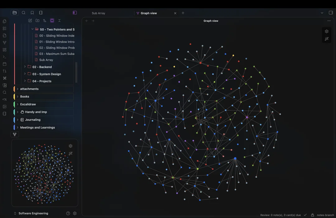
As labels overlap and connections multiply, that work can become demanding. Reducing clutter helps, but the deeper issue is whether the display contains the information needed for the task.
Suppose two notes are connected. One might support the other, criticize it, share a source, or merely mention the same broad subject. The line alone may not distinguish those possibilities. That gap is the subject of Why Backlinks Are Not the Same as Relationships.
Likewise, a large or central node may reflect how often you linked to it. It need not identify your strongest insight. A cluster can reflect a useful subject area, but also a habit of applying the same tag. An isolated note can contain an important new idea that you have not yet connected.
Even the layout requires care. Obsidian, for example, exposes controls for forces such as repulsion and link distance. The position of two dots is therefore partly a layout result, not an independent measurement of their conceptual similarity. Obsidian graph documentation.
These are reasons to interpret a graph carefully. They do not make it worthless. An overview can provide orientation and an invitation to explore, as long as the interface gives you a way to investigate what you see.
What users say about Obsidian graphs
A revealing Obsidian forum thread began in November 2023. Its author had moved their notes to Obsidian to capture material for stand-up comedy, and said their initial reason for choosing the app was its graph view: they had hoped it would uncover hidden relationships between jokes and topics and help them build a storyline of interconnected notes. They wrote that they never found it useful, because it did not work the way they had imagined. Read the user discussion.
The replies, which run to September 2025, describe very different outcomes:
- Two said they had switched the graph off entirely, and a third that they never used it.
- One used it to see “where I am” after importing 2,500 unlabeled notes, including how much weight those notes carried against the rest of the vault.
- Others recommended the local graph, filtering by a search, and bookmarking those filtered views to reuse later.
- One user called it “the most important pillar” of their vault; another said they found little practical use for it but enjoyed seeing their connections drawn.
- Two used it to track progress: one to see which help files had been translated, the other to see which subjects still needed study.
- In July 2024, a user posting as bobdoto said the local graph was “really helpful when I need it to be (which isn’t often)”, and linked a video of themselves using it to write an article.
- A user who had built a graph plugin of their own argued that the default view “looks pretty” but is “just a visualization with no additional information or interpretation layer on top.”
These accounts suggest that the same feature can serve orientation, progress tracking, occasional discovery, simple enjoyment, or no purpose at all in a particular workflow. The discussion does not establish how common any of those experiences are.
Obsidian’s documented local graph focuses on the active note and can show connections at different depths. That creates a manageable starting point for following a thread through relevant material. Local graph documentation.
Logseq shows why the unit of connection matters
Logseq’s official introduction emphasizes outlines, journals, blocks, and linked references. A person can record information in a daily journal and later retrieve it through the pages mentioned in those blocks. That linked workflow has value even when the user never opens a visual network. Logseq’s introduction to networked thinking.
A July 2024 forum post exposed a specific mismatch. The user wrote meetings into journal blocks, referring to people and a project, and used linked references to retrieve that context — for instance, seeing a colleague alongside the project they worked on. In the graph, however, the referenced pages each connected to the journal page, not to each other, so the person-to-project relationship they wanted to see was missing.
A reply explained that showing every indirect connection would make the graph noisy as notes accumulate. It suggested moving the parts that are lasting knowledge — such as who works on which project — out of the journal and onto the page they belong to, leaving the meeting itself in the journal. Read the Logseq discussion.
This is a historical account, not a test of every current Logseq version. It illustrates a lasting design problem: a graph must represent relationships at a level that matches the question the user is asking.
In October 2024, another user wanted to see their block references as a graph. The suggested workaround was to tag the referenced block and find it through a page’s Linked References, and the user reported that it worked. The immediate need was met through a textual view of connections. Read the follow-up example.
For someone trying to remember who said what about a project, retrieving the relevant passage may deliver the benefit more directly than inspecting the whole network.
flomo broadens the question to review and rediscovery
flomo is a useful comparison because its product centers on quick capture and returning to earlier notes. Its own introduction describes the app as focused on helping you record more ideas and review past records better. flomo’s product introduction.
Its visual features serve several different purposes, and they are easy to confuse if they are all called a graph. Even flomo’s feature list names a “note relationship graph”, while the page it links to documents a recording heatmap and statistics — including, for Pro members, a tag tree and a tag matrix.
A heatmap makes recording activity visible
flomo’s heatmap shows how much you recorded each day. Clicking a day with notes filters the list to that day. It can help someone notice a writing habit and return to a period of their life. Heatmap documentation.
That is useful information, but it does not show the quality of the ideas or how well they connect. More recorded notes and deeper understanding are different outcomes.
A cognitive map helps people revisit recurring subjects
flomo’s Cognitive Map, a Pro feature, groups notes by how similar their content is into a landscape of “peaks”. Users can inspect areas and play the map back month by month. Its documentation states that it refreshes monthly and randomly loads up to 5,000 notes per run. Cognitive Map documentation.
This supports a different question from a manually linked network: “What subjects recur in what I have been writing, including ones I never labeled?”
The map may prompt someone to revisit an interest they abandoned or recognize a subject they keep returning to. The resulting groups are still a model-based view of the recorded material. Their presence does not establish expertise, and their absence does not prove the user has never considered a subject.
Related notes can deliver the benefit in a smaller view
flomo’s Related Notes feature, also Pro, recommends material related to the note you are viewing. Among the uses its documentation collects from community contributors, 机智的阿饭 describes finding writing material without having to remember the original keywords, and MoonTree describes gathering related notes into an index card around a question. These are accounts the vendor chose to publish, so they illustrate possible uses rather than typical results. Related Notes and user examples.
flomo’s Random Walk, another Pro feature, offers a further perspective: rediscovering old notes can be worthwhile in itself. Its documentation describes wandering from note to note through loose associations, with no post, task, or project generated at the end. Random Walk documentation.
A meaningful encounter with your past thinking is a legitimate outcome. It is simply a different promise from improving research or decision-making.
What reviewers mention
App Store reviews add a view of what people valued, with caveats. Apple’s public review feed returned 935 reviews from flomo’s Chinese App Store listing; 408 are from 2021 and 2022, and 161 of those were posted on a single day in March 2021, nearly all five stars. They are a record of what some enthusiastic early users chose to say, not a measure of satisfaction. flomo on the App Store.
The early reviews praise easy, pressure-free recording, private writing that does not have to be shared, quick entry, daily review, and Random Walk. One reviewer liked being able to read everything from the main list without opening each note. Across all 935 reviews, three mention links or a graph at all: one in 2021 returning to the app because bidirectional links had arrived, one in 2023 asking for a “knowledge star map” because the notes had become too fragmented to see the shape of their knowledge, and one in 2026 saying the knowledge graph showed them which subjects they had been reading into. (Our translations.)
Three reviews prove nothing about how many people want a graph. They do show what the people who asked for one wanted it for: to see the shape of what they had written.
Capacities and Heptabase offer two other visual approaches
Capacities keeps its graph local to one object. It shows incoming and outgoing connections, and property-based links can display the property name as a label. The documentation explicitly says it does not have a graph of the whole space. Capacities graph view.
That gives the user a defined starting point. Open a person, book, or page, then explore what connects to it. For a question about one subject, a focused neighborhood can reduce the amount of interpretation required before reaching relevant content.
Heptabase emphasizes whiteboards and cards, alongside bidirectional links and source material such as PDFs and highlights. Heptabase product overview.
A whiteboard can support a different activity from viewing an automatically laid-out network. You can deliberately place evidence beside a claim, separate competing explanations, and arrange a line of thought. In that use, the arrangement records your developing interpretation.
These are assessments of the documented interaction models, not conclusions from a user satisfaction comparison. Each approach also has a cost: a local view gives a limited overview, while a deliberately arranged board requires maintenance as your thinking changes.
The practical value should be visible in the next action
Across these approaches, several ordinary uses are worth distinguishing. The examples below are illustrative tasks a reader can test, not claims that every app supports every workflow.
| What the user wants | How a connection view can help | A sign that it worked |
|---|---|---|
| Find something they only partly remember | Offer relevant neighbors or related notes from a recognizable starting point | They recover the original note and its context |
| Resume an interrupted project | Bring together the people, questions, decisions, and sources associated with it | They can explain where the work stopped |
| Explore a topic without an exact search term | Surface adjacent material and let the user follow a thread | They find relevant material they did not know to search for |
| Compare different accounts of an idea | Bring the relevant passages close enough to read together | They identify a meaningful agreement, difference, or contradiction |
| Reflect on changing interests | Make it possible to revisit subjects across time | They recognize a change and check it against the actual notes |
| Develop a piece of work | Help select, group, and explain relevant material | They produce a clearer argument, outline, question, or decision |
The mechanism is fairly concrete: reduce the effort required to choose what to inspect, recover the context, and make sense of the relationship.
A graph earns its place when it helps with one of those steps. Its value is harder to establish when the user spends most of the session tuning the display and leaves without having read or understood anything new.
What Jotaid needs to contribute
For Jotaid, this sets a useful standard. Offering another attractive network is only the beginning. The design must help people understand and use the relationships it exposes.
Jotaid’s graph uses concept Nodes, with edges representing concepts appearing in the same notes. The graph operates within the selected project, and a concept’s detail view connects back to the notes referencing it. Jotaid graph documentation.
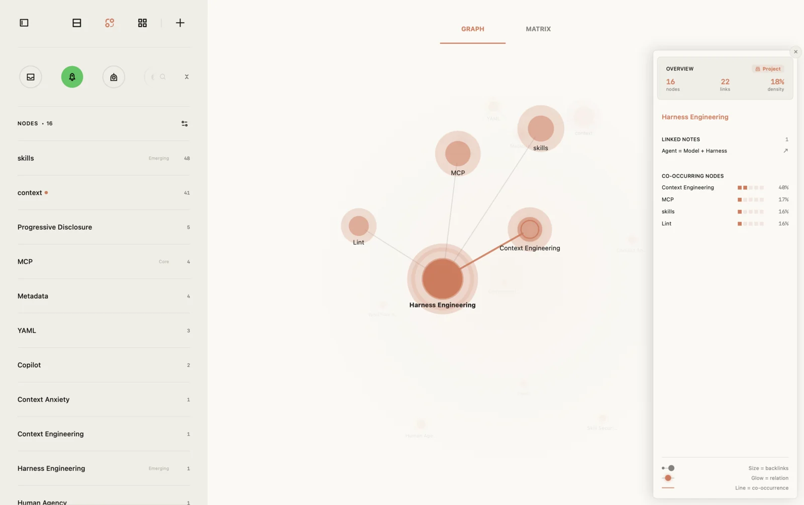
Its co-occurrence matrix provides a way to inspect the relative strength of those relationships. Core, Bridge, and Emerging badges provide additional navigation cues about network structure or recent activity. Co-occurrence matrix, Node types. The graph, the matrix and the badges are part of the free tier and analyse the links you wrote yourself. Free vs Pro.
The intended benefit is to make a large collection easier to approach. Someone can choose a concept, inspect a related concept, read the supporting material, and decide what the connection means. A Theme then provides somewhere to gather relevant notes and write a synthesis. Themes.
Consider a designer who has notes from interviews and reading. “Uncertainty” repeatedly appears alongside “onboarding.” The useful moment comes when they inspect those notes and distinguish uncertainty about the next step from uncertainty about the product’s value. That distinction might change the question they ask in the next interview.
The graph can help direct attention toward the material. The designer still has to establish whether the distinction is justified.
Jotaid faces the same limits as other tools. A long note containing many concepts can create broad co-occurrence that deserves closer inspection. Inconsistent concept names can fragment the picture. A frequent pairing can reflect disagreement, comparison, or repetition rather than a strong explanatory relationship.
AI interpretation may help formulate an explanation, but that explanation remains something to review against the sources. It requires Pro and a user-configured API key. AI interpretation documentation.
The graph also does not have to be read only inside the app. On macOS, Jotaid can serve your notes over MCP to an AI agent running on the same Mac. When part of the graph is hard to interpret, you can ask the agent about it in plain language — why two concepts keep turning up together, for instance. The agent can look up a concept, see which other concepts share notes with it and how strongly, and open the notes behind those connections before it answers. A line you could not read becomes a conversation grounded in your own material. The connection is read-only, off by default, limited to the projects you choose, and requires Pro. Its answers are interpretations too, so check them against the notes themselves. Release notes.
These capabilities describe a proposed path to usefulness. They are not evidence that Jotaid users learn more or work faster than users of another app. Those outcomes require observation and testing.
A simple way to evaluate your own graph
Choose a question from your actual work or life. It could be “Why did we choose this approach?” or “What have I written about this subject before?”
Try answering it with the graph. Then compare that experience with search, backlinks, a related-notes list, or an index you already use.
If you want a step-by-step routine for this in any app, How to Use a Knowledge Graph for Notes walks through one.
Pay attention to four things:
- Relevance. Did it help you find material worth reading?
- Context. Could you see why the items were connected and return to the original notes?
- Understanding. Could you explain the relationship more clearly afterward?
- Effort. Was the result worth the work of maintaining links, filtering, and navigating?
For reflection or open-ended browsing, use a different test: did the experience help you revisit something meaningful, and would you willingly return to it?
This allows a graph to be valuable occasionally. A feature used once a month can still matter if it helps someone recover an important thread. Daily use is not the only measure of success.
Beauty is an invitation to return
Visual appeal can make a collection feel inviting and encourage someone to explore it. That is a valid part of product design. A satisfying overview may also make the effort of keeping notes feel more tangible.
The stronger promise begins when the interface leads from that overview to readable material, understandable relationships, and something the user values doing.
For some people, that will happen through Obsidian’s local graph. For others, through Logseq’s linked references, flomo’s rediscovery features, an object’s neighborhood in Capacities, or a board in Heptabase. Jotaid’s opportunity is to make the movement from concepts and relationships to interpretation and Themes feel useful in everyday work.
A beautiful constellation can make you want to enter your notes. A useful knowledge system helps you understand something once you get there.
Cover image by Freepik.