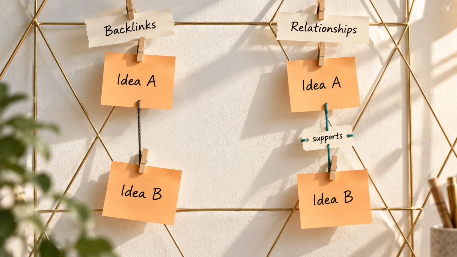
Appearance
What a Co-occurrence Matrix Can Reveal About Your Notes
Everything in your graph is connected. That was never the question.
Say you have spent four months reading about remote work. You have 140 notes and 38 concepts, and you have been careful with them. When a note is about async writing, it says [[async writing]]. When it touches onboarding, it says [[onboarding]]. One afternoon you open the graph, expecting to see what you have been thinking about.
What you get is a ball of lines. The ball says one thing very clearly: everything is connected to everything.
That is true, and it does not help. You knew your notes were connected. You connected them. The questions you actually have are narrower, and every one of them is a question of degree:
- Which of these ideas keep turning up together, and which do I mention together once and never again?
- Is documentation its own thread in my notes, or is it another name for handbook?
- Which two ideas have never shared a note, even though they obviously belong in the same argument?
A picture made of lines is a poor place to answer them. A line says that two concepts met. Some tools draw a stronger pair with a thicker line, and that helps, but you still have to find the line among hundreds of others and judge its thickness by eye against lines on the other side of the picture. The more you have written, the worse this gets, because every new note adds lines to the same space.
This is not only a complaint about crowded screens. In an experiment published in 2005, three researchers in France, Mohammad Ghoniem, Jean-Daniel Fekete and Philippe Castagliola, gave 36 people the same graphs drawn two ways: as nodes and lines, and as a grid in which every node has a row and a column and a filled cell marks a link. The people answered seven kinds of question, such as finding the most connected node, checking whether two nodes are linked, or finding a neighbor two nodes share. The researchers' summary: "when graphs are bigger than twenty vertices, the matrix-based visualization outperforms node-link diagrams on most tasks. Only path finding is consistently in favor of node-link diagrams throughout the evaluation."
Their graphs were random ones with nodes named by letters, not anyone's notes, so treat the result as a strong hint rather than a verdict about note apps. Their own conclusion was not that one picture wins. It was that the two are complementary: "node-link diagrams are well suited for small graphs, and matrices are suitable for large or dense graphs." Your remote-work project, with 38 concepts, is already past the size where the grid started to win.
Seeing links, and reading structure
A co-occurrence matrix is the grid version of your notes. Every concept gets a row and a column. The cell where two of them cross says how often they appear in the same note.
"How often" needs one refinement to be worth anything. Three shared notes mean a lot for two concepts that each appear in five notes; three shared notes mean almost nothing for two concepts that each appear in sixty. So the cell does not hold a raw count. It holds a share: of all the notes that mention either concept, the fraction that mention both. A pair that always appears together scores near the top. A pair where each concept is common but they rarely meet scores near the bottom, however many notes you have.
That one change turns the grid into something you can read. Every cell is on the same scale, so a dark cell in a busy corner of your notes means the same thing as a dark cell in a quiet one, and your eye can compare cells across the whole grid at once.
This is the distinction the rest of this article is built on. A graph is for seeing links: that two things touch, and how you get from one to the other. If your question is "how does time zones connect to burnout?", keep the graph; that is the one task where lines won in the experiment above. A matrix is for reading structure: how much two ideas belong together, compared with every other pair you have, and which parts of your thinking form blocks, which join them, and which stand alone.
Reading structure is a skill, the way reading a chart is. It has a small vocabulary of shapes, each of which means something specific about your thinking and suggests something specific to do next. The next section is about where that vocabulary came from. It was not invented for note-taking. People have been reading co-occurrence data for more than forty years, to find out what whole scientific fields are about, and they worked out several of the rules the hard way.
Forty years of reading co-occurrence
The grid was not invented for notes. It comes from the study of science itself, where people have spent decades counting which words and which papers turn up together. Three pieces of that work carry over directly. Each one comes with a rule for reading, and I will state what the researchers wrote first, then what I take it to mean for a notes project.
What appears together shows how a field is organized
In 1983, Michel Callon and three colleagues published a paper whose subtitle was An introduction to co-word analysis. By 2009, co-word maps were familiar enough that two researchers at Erasmus University Rotterdam and Leiden University, Nees Jan van Eck and Ludo Waltman, could describe them in passing, in the first paragraph of a methods paper: "data on co-occurrences of words can be used to construct so-called co-word maps, which are maps that provide a visual representation of the structure of a scientific field." (The paper was published that year in the Journal of the American Society for Information Science and Technology. Quotations from it here, other than from its abstract, come from the working-paper version the authors released the same year.)
Notice where the structure comes from: which words keep appearing in the same documents.
My reading, for notes: your folders, tags and project names are the structure you declared. The grid shows the structure you wrote. When the two disagree, the grid is not wrong. It is telling you how you actually think about the subject, which is often not how you set out to organize it. Rule one: read the grid as evidence about your thinking, and your filing as a hypothesis about it.
Which normalization you choose decides what a cell means
Raw counts are useless for comparison, as the last section showed: two concepts that each appear everywhere will share many notes whether or not they have anything to do with each other. So every co-occurrence grid normalizes. The question is how, and van Eck and Waltman's paper, How to normalize co-occurrence data?, is about exactly that.
They sort the common measures into two families. One family, which they call set-theoretic, asks how much two sets overlap. The share described in the last section, notes with both concepts out of notes with either, belongs to that family. The other family, which they call probabilistic, asks how far the number of shared notes is from what chance alone would produce, given how common each concept is. Their verdict, from the published abstract: "Both our theoretical and our empirical results indicate that cooccurrence data can best be normalized using a probabilistic measure."
Their reason is worth seeing with numbers. Here is an example of the same kind they use, translated into the remote-work project, with numbers I made up to show the effect. Out of 140 notes:
- meetings and time zones each appear in 42 notes, and share 17 of them;
- mentoring and burnout each appear in 5 notes, and share 2 of them.
Both pairs score about 25% as a share. They look equally related. But if meetings and time zones were unrelated, you would still expect them to share about 13 notes, just because each of them is in almost a third of everything you wrote. Seventeen is not much more than that. For mentoring and burnout, chance would predict far less than one shared note; two is about eleven times what chance predicts. The second pair is the surprising one, and the share hides it. In their words, the set-theoretic measures "yield systematically higher values for frequently occurring objects than for objects that occur only a limited number of times."
They are also careful about the scope of their verdict. In the conclusion of the working-paper version, they write that the two families "serve different purposes, and it therefore makes no sense to argue that one measure is always better than another." Their argument is about normalization in scientometric research: mapping a field, where the point is to correct for how common each term is.
That is what the paper says. What follows is mine.
Jotaid's grid uses the share, the set-theoretic kind. I think that is the right first measure for a personal notes project, even with this paper in mind, because a notes project asks a different first question from a map of a scientific field. The first thing you want to know about two of your own concepts is how much of their lives they share, and the share answers that in words you can say out loud: of the notes where either of these appears, a quarter have both. It also makes one pattern unmistakable. Two concepts that appear together nearly every time are almost always one idea under two names, and the share says so directly, because it reaches the top of its scale. A chance-based measure says something different about the same pair: that they meet far more often than chance, which is true of any two concepts that genuinely belong together, not only of duplicates.
But the paper's objection holds for your notes too, and it changes how you should read the middle of the grid. Rule two: before you trust a medium cell, look at how common both concepts are. The same share between two rare concepts says more than it does between two concepts that are in everything. A medium cell between your two most-used concepts may be nothing more than the fact that you write about both a lot.
The order of the rows decides what you can see
A grid has one more degree of freedom that a list of numbers does not: the order of its rows and columns. In a 2016 survey of matrix reordering methods, Michael Behrisch, Benjamin Bach, Nathalie Henry Riche, Tobias Schreck and Jean-Daniel Fekete put it plainly: "the goal of matrix reordering is to make visual patterns emerge, which represent data properties of the underlying network. To understand why this is possible, it is essential to realize that the order of matrix rows and columns can be freely changed without changing the data in the matrix."
They name the patterns that good orderings reveal. The most important is the block: "Coherent rectangular areas appear in ordered matrix plots whenever strongly connected components or cliques are present." Blocks, they write, "would be referred to as cohesive groups or clusters." And they add a detail that matters for anyone reading their own notes: "many networks show block patterns with missing cells, meaning that clusters have missing connections (i.e., holes) or being connected to other clusters (i.e., off-diagonal dots)." They also name the pattern that shows you nothing, the "salt-and-pepper" noise that appears "whenever the row-/column ordering is not able to reveal the underlying graph topology or if simply no structure exists."
My reading: the same data sorted alphabetically is mostly noise. Sorted so that concepts which keep appearing together sit next to each other, it shows blocks. Rule three: only read shapes in a grid whose order was chosen to reveal them, and treat the group boundaries as a proposal rather than a fact. The grouping is computed from your notes. It can split a thread you think of as one, or join two you think of as separate, and either result is worth a look.
Read at three levels
The same survey recalls a distinction from Jacques Bertin's Sémiologie graphique. As Behrisch and his colleagues summarize it, a data display holds information at three levels: an elementary level, for understanding individual elements; an intermediate level, for "comparisons among subsets of graphic elements and the discovery of homogeneous information parts"; and an overall level, "comprised of overall trends and relations."
Rule four: read a co-occurrence grid at all three. A single cell tells you about one pair. A block, or a row, tells you about a group of concepts or about one concept's company. The whole grid tells you what shape your thinking has: a few dense threads, many loose ones, or one idea everything else hangs from.
Those three levels organize the next section, which is the core of this article: the shapes that show up in a grid of your own notes, what each one means, and what to do when you see it.
Seven shapes, and what to do about each
Back to the remote-work project: 140 notes, and a grid sorted so that its blocks show. The numbers below are the example's, not a measurement of anyone's real notes. What they illustrate is how each shape reads.
Each shape gets the same three questions. What do you see? What does it mean? What should you do next?
Level one: a single cell
1. The cell that is almost full. Documentation appears in 21 notes and handbook in 19, and 18 notes have both. The share is 82%.
When two concepts turn up together nearly every time, they are rarely two ideas. They are usually one idea you have been naming two ways, depending on what you had just read. This is the one reading where a very strong result is a problem rather than a finding, and the earlier article on backlinks and relationships has more on why.
Do next: open the notes where each appears without the other. If the difference between them is real, write it down in one sentence, because you will need it. If you cannot find one, merge them. Every other reading of the grid gets sharper once one idea has one name.
2. The strong cell you never decided on. Time zones is in 42 notes and documentation in 21, and 18 notes have both, a share of 40%. Rule two says to check what chance would give: about 6 shared notes. Eighteen is roughly three times that.
You never wrote a sentence connecting the two. You wrote notes about time zones, and notes about documentation, and the grid shows you kept writing them together. That is usually a claim you already believe and have not stated. Here it might be that remote teams write things down because they cannot all be awake at the same time, which is a different argument from "remote teams write things down because writing is better."
Do next: state the claim in one sentence, then find the notes that support it and the ones that complicate it. A strong cell is where to look, not what to conclude.
3. The middle cell between two popular concepts. Meetings and time zones share 17 of their notes, a share of 25%. It looks like a solid relationship, in the same range as many others in the grid. Rule two is the correction: each of them is in 42 of the 140 notes, so chance alone would put about 13 notes in common. Seventeen is not much more.
The cell reflects how much you write about both topics, not a special connection between them.
Do next: usually nothing. If you want to be sure, compare it with mentoring and burnout, which also share 25%, but as 2 notes out of 5 each. Chance would predict almost none. That quiet pair, not the loud one, is the relationship worth a second look.
4. The cell that is empty but should not be. Async writing is in 30 notes and onboarding in 16. They have never appeared in the same note.
An empty cell usually means nothing: most pairs of concepts have nothing to do with each other. This one is different for two reasons. The first comes from rule two. Both concepts are common enough that chance alone would give them about three notes in common, and they have none, so the gap itself is unusual. The second is company. The two share several neighbors, concepts that each of them keeps appearing with, and yet they never meet. That combination, an absent pair with plenty of friends in common, is what link prediction looks for, and it was the example at the end of the first article in this series: every remote process got written down except onboarding, which everybody still does by talking.
Do next: put the two side by side and ask why they have never met. Sometimes the answer is dull, because the topics really are separate. Sometimes it is the most useful sentence you will write that month.
Level two: a block, and a row
5. The block, and the holes in it. The sorted grid shows two dense squares along the diagonal. One holds async writing, documentation, handbook, time zones and meetings: how remote teams communicate. The other holds onboarding, mentoring, trust and feedback: how they bring people in.
A block is a thread of thinking you actually have, as opposed to one you planned. Compare it with your folders and tags (rule one). If a block cuts across two folders, the folders may be the wrong shape for what you are writing. If a folder you care about never forms a block, you may have filed notes about it without ever thinking about it.
Then look for holes. Inside the second block, mentoring and trust have never shared a note. Rule two again: mentoring is in only 5 notes and trust in 12, so chance predicts less than half a shared note, and the hole says little on its own. A hole between two common concepts inside a block would be worth more attention.
Do next: give each block a name in your own words, not the name of the folder it came from. If you cannot name one, it is probably two threads that happen to share a few concepts.
6. The bright cell between blocks. Outside the two squares, one cell stands out: feedback, from the people block, with async writing, from the communication block. They share 8 notes, a share of 22%, nearly three times what chance would give.
A cell between blocks is a bridge. It is the place where two threads you think of as separate turn out to be one argument. Bridges are often the most interesting cells in the grid, because they are where your own thinking is ahead of your own filing. Here, it might be that written feedback is how remote teams build the trust that the people block is about, which puts the two threads in conversation.
Do next: write a note about the bridge itself, whose subject is the connection rather than either concept. That note is often the start of the most original thing you will say about the subject.
7. The row that stays dark. Hiring is in 4 notes, and shares only one of them with anything else in the grid, a single note with onboarding. Its row is nearly empty from end to end.
An empty row means one of three things. The concept is new, and hasn't been written about enough to connect. It is a tangent, and belongs in another project. Or you have been writing about it without marking it, so the notes that should connect it never say its name.
Do next: decide which of the three it is. The third is common and cheap to fix: search your notes for the word and mark the places where it is really the subject.
Level three: the whole grid
Step back and look at the grid as a picture. Three overall shapes are common, and each one says something about how the project is going.
A few clear blocks with a bridge or two is a project that has found its threads. This is the shape the remote-work example has, and the time to start writing out what each block claims.
Salt and pepper, Behrisch and colleagues' name for the pattern where no ordering reveals anything, usually means one of two things in a notes project: not enough material yet, or concepts that are too broad to distinguish anything. With a few dozen notes, the first is almost always the answer. Keep writing and look again in a month.
One row that is lit all the way across means a concept appears in nearly everything. Suppose you had also marked remote work itself, in 120 of the 140 notes. Its row would be a band of medium cells: a quarter with async writing, about a third with meetings. Rule two explains why that tells you nothing: a concept in almost every note shares notes with everything, by default. The subject of the project is not a useful concept inside the project.
Do next: stop marking the umbrella topic. Mark what each note says about it.
These seven shapes, and the three shapes of the whole, are what a co-occurrence grid can show you. What follows is what it cannot show, because every one of those readings can be wrong.
What the grid cannot tell you
Every reading in the last section can be wrong, and it helps to know the ways in advance. There are five.
It does not know why two concepts meet. Two ideas that always appear together might support each other, contradict each other, or be the two sides of a debate you keep returning to. The cell looks the same in every case. The earlier article on backlinks makes this objection at full strength. For reading the grid, the practical consequence is simple: a strong cell tells you where to read, and only the notes tell you what you will find.
It counts what you marked, not what you meant. The grid is built from the concepts you named in your notes. If you mark trust carefully in the notes where it is the point, and forget it in half the notes where it matters, the grid reflects your marking habits as much as your thinking. The dark row for hiring in the last section might be exactly this. Nothing in the grid can tell you which notes should have said a concept's name and did not.
Small numbers swing. With few notes, one note changes everything. Two concepts that each appear in 3 notes and share 1 score 20%. Write one more note that mentions both, and they score 33%. Neither number means much. The shapes in the last section need material: dozens of notes marked with concepts before the blocks separate from the noise, and more before the middle cells mean anything. Early on, read only the extremes: the almost-full cells and the empty rows.
The note is the unit, and some notes are too big. Co-occurrence means "in the same note," whatever the note's size. A three-line note that names two concepts adds one pair to the grid. A long meeting summary that names twenty concepts adds 190 pairs at once, each counted as a full co-occurrence. A few long notes like that can light up a whole region of the grid without any of those concepts being closely related. If a block looks suspicious, check whether it is really one or two big notes. Short notes, each about one thing, make a sharper grid, which is one more argument for the slip-box habit of one idea per note.
It adds up all of time. A pair that shared fifteen notes last year and none since looks just as strong as a pair that shared fifteen notes this month. One is a conversation you finished; the other is the one you are having now. The grid by itself cannot tell them apart. You need to look at when the shared notes were written.
None of these is a reason to distrust the grid. They are reasons to treat every shape as a question, and to go to the notes behind a cell before you write down an answer.
Build one by hand first
You do not need any particular app to try this. Doing it once by hand, on a small sample, is the fastest way to understand what every number in a grid means. Here is a version that fits in an evening.
- Pick eight to ten concepts from one project. Choose ideas you write about, not the project's umbrella topic (level three explains why). Ten concepts give you 45 pairs, which is plenty.
- Take a sample of notes, say the last 30 you wrote on the subject. Make a spreadsheet with one row per note and one column per concept. Put a 1 where a note is genuinely about that concept, and leave the rest blank.
- Count each concept. The total of each column is how many notes that concept appears in.
- For each pair, count the notes that have both. In a spreadsheet,
SUMPRODUCTof two columns of 1s does it in one formula. - Work out the share. Notes with both, divided by notes with either. Notes with either is the two column totals added together, minus the notes with both.
- Work out what chance would give. Multiply the two column totals and divide by the number of notes in your sample. Compare it with the real count of shared notes. This is rule two, and doing the arithmetic once makes it stick.
- Draw the grid and order it. Put the concepts along both edges and fill each cell with its share, shaded in three steps: empty, some, a lot. Then reorder by hand: start with the strongest pair, add the concept that shares most with those two, and keep going. Rule three is easy to feel here. The same numbers in alphabetical order look like nothing, and after ten minutes of reordering, blocks appear.
- Read it with the seven shapes. Most likely you will find one near-duplicate, one strong pair you never stated, and one concept that sits alone.
Thirty notes is a small sample, and the swings described above apply in full. The point of the exercise is not the result. It is that you will never again look at a shaded cell without knowing what went into it.
Doing it once is instructive. Doing it every week, across every project, as the notes keep coming, is the part a tool should take off your hands. That is the last question this article has to answer: how Jotaid lays out the grid, and where each of the seven shapes shows up in it.
Where the seven shapes show up in Jotaid
Jotaid keeps the grid one view away from your notes. In Node view, switch to Matrix. On iPhone, the capsule at the bottom toggles between Graph and Matrix. It is there in every project, including the free Inbox, and it counts the [[links]] you wrote yourself. Nothing on it requires AI.
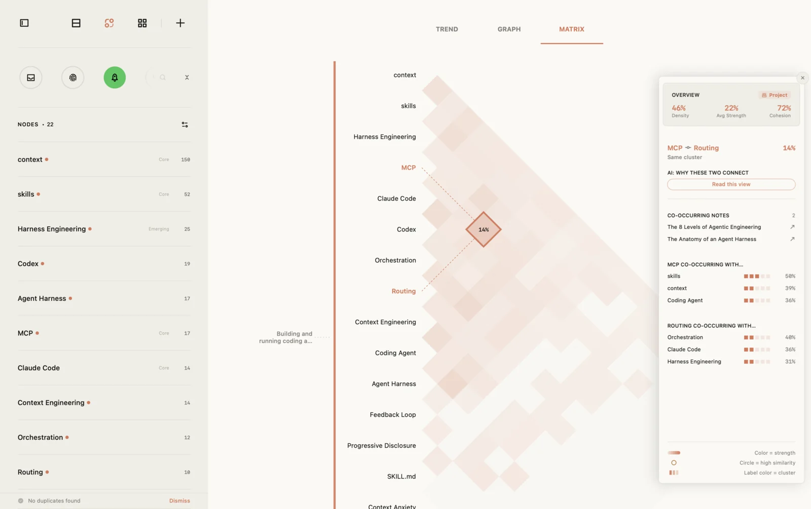
It is drawn as half a grid, turned on its corner. A co-occurrence grid is symmetric. The cell for feedback and async writing holds the same number as the cell for async writing and feedback, and the diagonal only pairs each concept with itself. In a square grid, more than half of the cells repeat something or say nothing. Jotaid draws only the unique half and turns it 45 degrees, so that a single column of concept names serves as both axes, written out in full rather than squeezed into rotated column headers. Architects planning which rooms of a building belong next to each other do something similar: they fill in only half of their grid, because the relationship between two spaces is the same in both directions.
Reading it takes one adjustment. A pair's cell sits where two diagonal lines meet, one running from each name; point at a cell on the Mac and Jotaid draws those two lines back to the names. The shapes from the last section turn with it. A group of concepts listed next to each other becomes a triangle resting on the names, and a bridge is a cell further out, between two triangles. The two figures earlier in this article draw the full square, because that is how the research describes these patterns. In Jotaid you are reading the same patterns, rotated.
A few things about the grid itself, before the shapes.
It shows the concepts you reference most. The grid holds up to thirty concepts, the ones that appear in the most notes. The remote-work project has 38, so eight of the least-used ones are not in it. Every concept, in the grid or not, still has a Co-occurrence tab on its own page that lists the concepts it shares notes with.
It is already ordered (rule three). Rows are grouped by how often concepts appear together, up to five groups, and a bar down the left edge marks where each group starts and ends. The groups are computed from your notes. Treat them as a proposal.
A cell's color is its share, darker for more of their notes in common. Hover over a cell on the Mac, or tap it on iPhone, and a panel shows the pair's share as a percentage, whether the two sit in the same group or different ones, and the notes behind the number.
Now the shapes, in the order of the last section.
1. The cell that is almost full. When a pair shares at least four in five of their notes, the cell gets a small circle in its corner, and the panel labels the pair High Similarity in the warning color. If you decide they are one idea, merge the two nodes. The references combine, and the old name is kept as an alias, so links you wrote before the merge still find their way.
2. The strong cell you never decided on. The panel's Co-occurring Notes list shows up to five of the notes the pair shares, with the full count beside the heading. Each note opens, and the heading takes you to the complete list on the concept's page. This is where a strong cell stops being a number and becomes sentences you can reread.
3. The middle cell between two popular concepts. This is the one shape where Jotaid leaves the arithmetic to you. The grid shows shares, not chance (rule two). To check a cell, you need how many notes each concept appears in, and then one multiplication: the two note counts multiplied together, divided by the number of notes in the project, is roughly how many shared notes chance alone would give. One caution: the number beside each concept in the node list counts mentions, not notes, so a note that names a concept three times counts three times there. For this check, count notes.
4. The cell that is empty but should not be. A concept's page has a Predictions section: pairs that have never appeared in the same note but share neighbors, with the shared neighbors named, so you can judge each prediction on its own evidence. It counts the links you wrote and nothing else. No AI is involved.
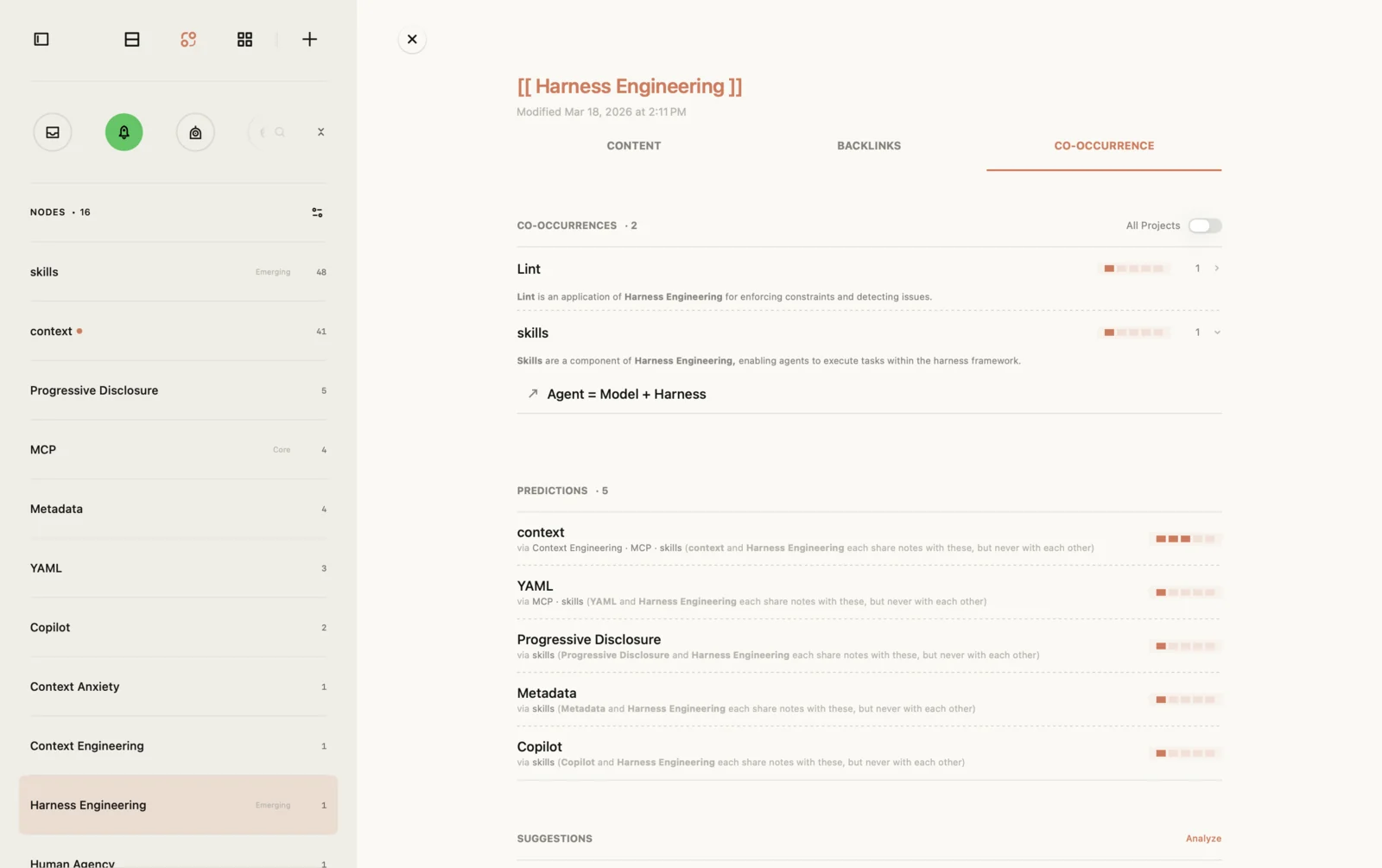
5. The block, and the holes in it. The bars on the left are the blocks. When the grid is too busy to read, the filter panel has three dials: a minimum number of shared notes (two or three clears away pairs that met once by accident), a strength range, and a filter by role. Once you have named a block in your own words, give it a home: on the Theme view's canvas, the notes become cards you can group into a theme, and the theme note is where the name and your current claim about it live.
6. The bright cell between blocks. The panel says Different clusters for a pair that sits across two groups. Below it are two lists, one for each concept, of the concepts each one appears with most, and the other member of the pair is highlighted in each if it makes the list. Sometimes a bridge ranks high in one list and lower in the other, which suggests the connection matters more to one of the two concepts than to the other.
7. The row that stays dark. A concept's page lists its unlinked mentions: notes where its name is written as plain text, without the [[ ]]. Turning them into links takes one click, and it only ever matches the exact name. For hiring, that is how you find out whether the row is dark because the idea is marginal, or because you never marked it.
The whole grid. With Pro and an AI provider of your choice, the matrix can also read itself. The AI names each group, and the names are drawn beside the grid. On the Mac, the overview panel gives a short reading of the whole table: a few observations, one question, and one next step that names a real concept. Single pairs are read on request. These are proposals in the same sense as the groups. The names are there to be kept, changed or ignored.
Two of the limits from earlier have partial answers. Why two concepts meet is what relations are for: with Pro, AI proposes a typed relation between two concepts, such as one being an application of the other, or a contrast, with the passage it read it from, and on the Mac a relation you reject stays rejected when the notes are analyzed again. Time is what the Trends view is for. It shows each concept on a timeline: when it first appeared, when it grew, when it went quiet. It follows single concepts, not pairs, so for a pair, open the shared notes and look at when they were written.
Thirty days later. The grid is recalculated from your notes every time, so it is never out of date and it never stores anything you have to maintain. What lasts is what you decided because of it: the merge, the claim you wrote in a theme note, the relation you kept or rejected. That is deliberate. The grid is where you notice things, and your notes are where you keep what you made of them.
Other tools that read co-occurrence
Jotaid is not the only tool that does this, and for some jobs it is not the right one.
If you want to map a research field from its literature, hundreds or thousands of papers, use VOSviewer. It is built by van Eck and Waltman, the authors of the normalization paper above, and it describes itself as "a software tool for constructing and visualizing bibliometric networks," with "text mining functionality that can be used to construct and visualize co-occurrence networks of important terms extracted from a body of scientific literature." Its manual lists association strength, the measure their paper recommends, as the default way to normalize. The two fit together well: map the field in VOSviewer, then think through the part of it you are working on in your notes.
If you want a network drawn from the words of a text rather than from concepts you chose, look at InfraNodus, which calls itself an "AI text analysis tool that uses knowledge graphs to generate insight and reveal what's missing," and lists Obsidian among its uses. Reading the words you actually wrote and reading the concepts you decided to name are different instruments, and they can disagree in useful ways.
The question you started with
You opened the graph wanting to know which of your ideas keep company, which of them are one idea twice, and which belong together but have never met. A picture of lines could not tell you. A grid can, once you know how to read it: check the share against how common each concept is, only trust shapes in a grid ordered to reveal them, and read at three levels, one cell, one block, the whole.
The reading is the skill. The grid only saves you the counting. And every shape it shows you ends the same way: in the notes behind it, where you decide what it means.
Sources
Every quotation in this article comes from one of these. Where a paper exists in more than one version, the one quoted is named.
- Mohammad Ghoniem, Jean-Daniel Fekete and Philippe Castagliola, "On the Readability of Graphs Using Node-Link and Matrix-Based Representations: A Controlled Experiment and Statistical Analysis," Information Visualization 4, no. 2 (2005): 114–135, doi:10.1057/palgrave.ivs.9500092. Quoted from the authors' preprint.
- Michel Callon, Jean-Pierre Courtial, William A. Turner and Serge Bauin, "From translations to problematic networks: An introduction to co-word analysis," Social Science Information 22, no. 2 (1983): 191–235, doi:10.1177/053901883022002003. Cited by title only.
- Nees Jan van Eck and Ludo Waltman, "How to normalize cooccurrence data? An analysis of some well-known similarity measures," Journal of the American Society for Information Science and Technology 60, no. 8 (2009): 1635–1651, doi:10.1002/asi.21075. The abstract is quoted from the published article; other quotations are from the working-paper version (ERIM Report Series ERS-2009-001-LIS).
- Michael Behrisch, Benjamin Bach, Nathalie Henry Riche, Tobias Schreck and Jean-Daniel Fekete, "Matrix Reordering Methods for Table and Network Visualization," Computer Graphics Forum 35, no. 3 (2016), doi:10.1111/cgf.12935. Quoted from the authors' copy. Jacques Bertin's three levels are cited as these authors summarize them.
- The descriptions of VOSviewer are quoted from its website and its manual for version 1.6.20; the description of InfraNodus from its website.
Cover image by Freepik.